Arizmendi is a neighborhood bakery and co-op located in San Francisco. I redesigned their website to appeal to a
younger audience.
My Roles
Market and user research, sketching, wireframing, prototyping, visual design
*This was an independent project
Outcome
Increased usability in basic user tasks
Lift in brand sentiment
Designing to empower a small business
A worker-owned cooperative
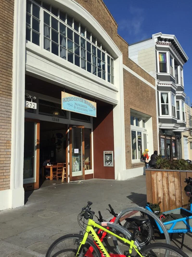
Located in the city’s Mission District, Arizmendi Bakery is a worker-owned cooperative known for its freshly-baked pizza and artisanal breads. Arizmendi has a strong reputation among locals for its ethical business practices and commitment to the local community, in addition to its delicious products.
The struggle of small businesses
Neighborhood businesses like Arizmendi must contend with the economic challenges of running a small business in San Francisco, in addition to increased competition from new and digitally-savvy businesses that are popping up to cater to the city’s younger demographic.
Because I’m a frequent customer, I’ve observed their brick-and-mortar bakery receives heavy foot traffic and repeat business from neighborhood customers. However, I noticed from observation and among my own friend group that Arizmendi was less popular among a younger demographic.

I felt Arizmendi’s website didn’t reflect the experience of going to the bakery in-person. I started to think
something could be done to enhance the online experience.
Identify the business opportunity
Looking at Arizmendi’s old website, I noticed much of the brand affinity I felt at the brick-and-mortar bakery was missing. Menu items like their signature pizza were buried on different pages and there was limited information about the co-op model. I started to think there was an opportunity to improve the business’s digital presence, aiming to increase engagement online and encourage a younger audience to visit in person.
My next step was to validate this business opportunity through research.
Understanding the competition and customer
Methodology Competitor research — On-site observation — In-person interviews — Survey
A unique business with untapped potential
What makes Arizmendi different
Looking at the websites of several competitors, I was struck by the saturation of the market and sleek, streamlined UI of most competitor websites. I realized Arizmendi’s co-op structure and mission could distinguish it among these other bakeries.
Who are Arizmendi’s customers
I spent a Sunday afternoon hanging out at Arizmendi, observing the customers and environment. I also conducted interviews with five customers at random. My time spent at the bakery in person revealed their existing customers are largely older and not engaged with the business online.
Who is Arizmendi missing
From my in-person interviews, I wanted to further explore/validate my realization that Arizmendi’s current customer base is largely older. I sent a short survey to 15 participants who live in the Bay Area and are between the ages 22-30.
Only 25% of participants had previously heard of Arizmendi or visited.
The opportunity.
Research validated my earlier assumption that Arizmendi’s current customer base was older. The real business opportunity was for the website to engage a younger audience.
Defining the the primary user and challenge
Methodology In-person interviews — Personas — Empathy Mapping — Affinity Mapping
The challenge of designing for two users
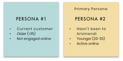
From my research, I was able to determine Persona #2 as my primary user, representing the greatest business opportunity.
At this point, however, I felt a tension between these two very distinct users. While Persona #2 represents my primary audience, I wanted to design a website that was still empathetic to Arizmendi’s current customer base — should they find themselves using it.
The challenge would be to somehow appeal to both. I’ll speak to the
solution I eventually reached later in the case study.
Research isn’t linear
At this point, I felt that I had insufficient information about my primary user to move onto the design stage. I decided to go back and do more in-person interviews and create a scenario and usability test on the current site.
For the second phase of interviews, I spoke with three participants ranging from the ages 23–25. I also conducted a simple usability test to understand how this sample audience navigates and experiences Arizmendi’s current website.
What I heard
“I follow a ton of food blogs like Eater SF and will also go off of recommendations from friends.”
“I always check out a business’s website before I decide to visit — mostly to check out the menu.”
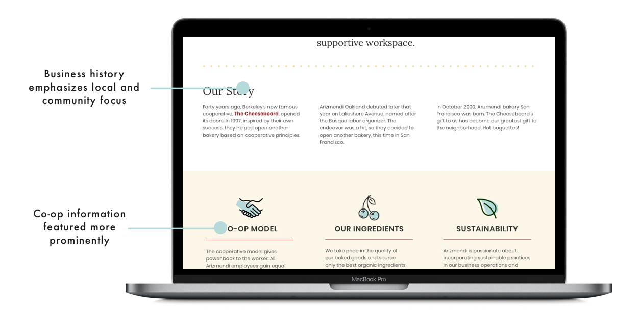
“I wish the co-op information were more prominent since that is something I’d like to support.”
Users discover and research restaurants online
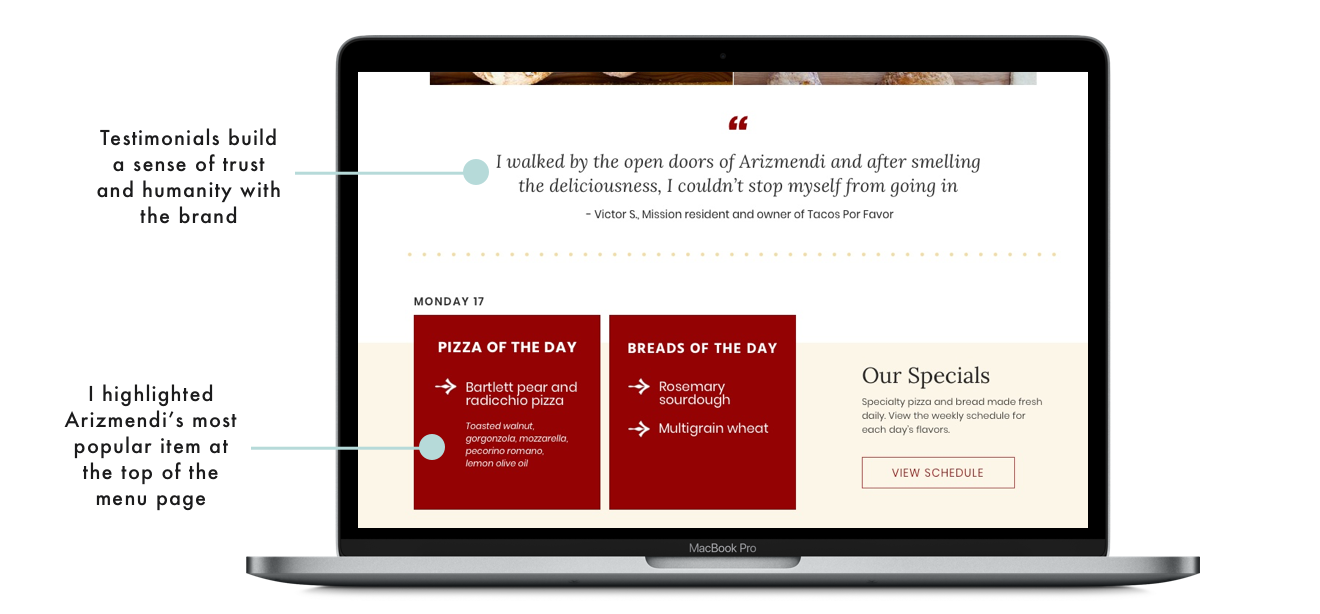
Pictures create authenticity and trust
Menu layout is confusing
Users care about business mission and ethics
Website fails to build a strong brand impression
The challenge
Redesign the website to encourage and enable first-time users to visit in person.
Brainstorming the solution
Before moving onto wireframes, I brainstormed several “How Might We” statements that would provide a framework for my design choices:
Create an online experience that would encourage users to visit in person
Show users relevant information they would need to visit in person
Distinguish Arizmendi among the users’ other food options
Build trust and affinity with the Arizmendi brand
Improving information architecture and content strategy
Methodology Information Architecture — Sketching — Wireframing — Prototyping — Testing
Simplifying menu navigation
One of the biggest challenges of this project was figuring out how to structure the menu. On the old website, menu items were spread across five separate pages. Users emphasized during interviews and testing that this layout was confusing and frustrating.
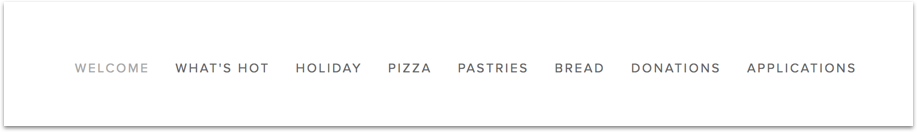
The navigation bar on the old website was cluttered and made menu items difficult to find.

Simplified the main navigation to just
two items with a drop-down
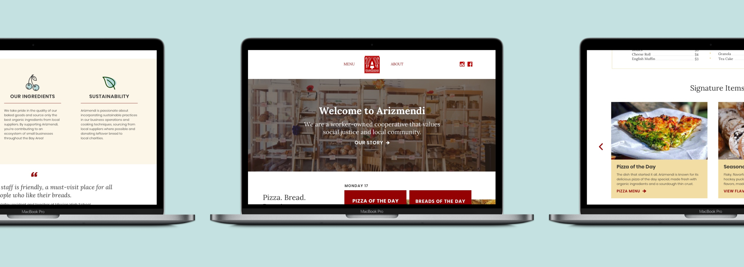
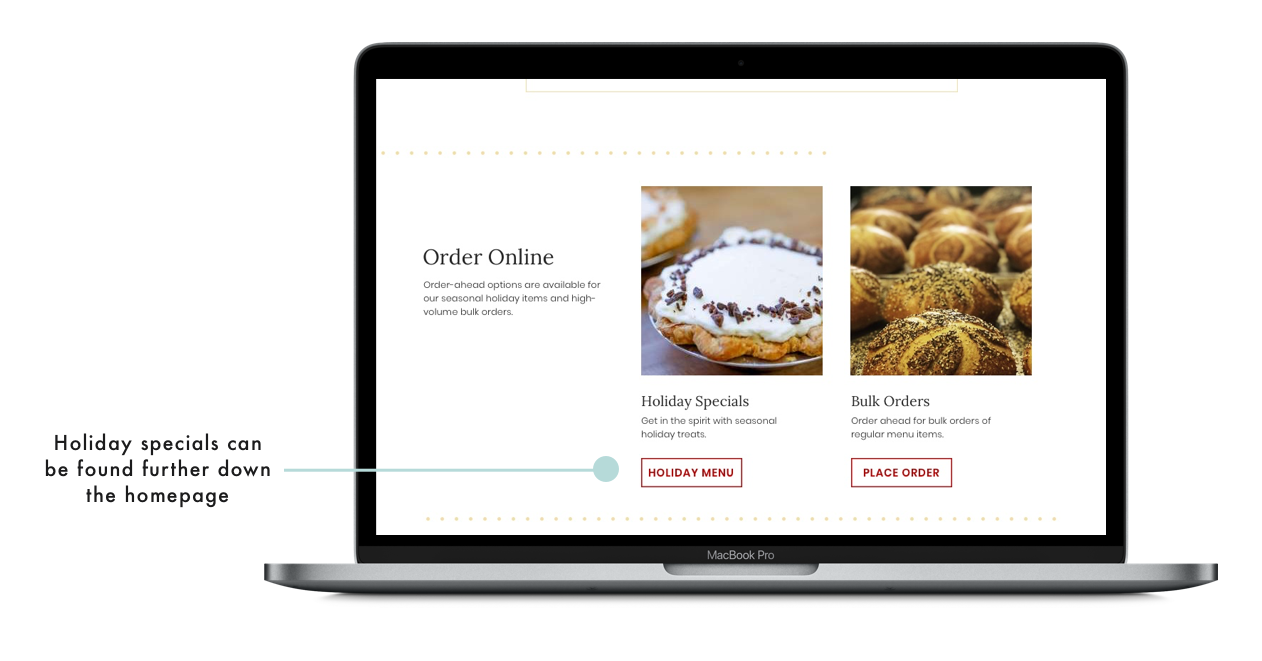
Solving for the menu issue, I consolidated the menu to just three unique pages (Menu, Daily Specials, Holiday), and made each of these discoverable from the homepage.
Another complication with the menu was distinguishing between Arizmendi’s specials that rotate daily, and its standard menu available every day. I went through multiple rounds of testing and interviews before settling on my final solution.
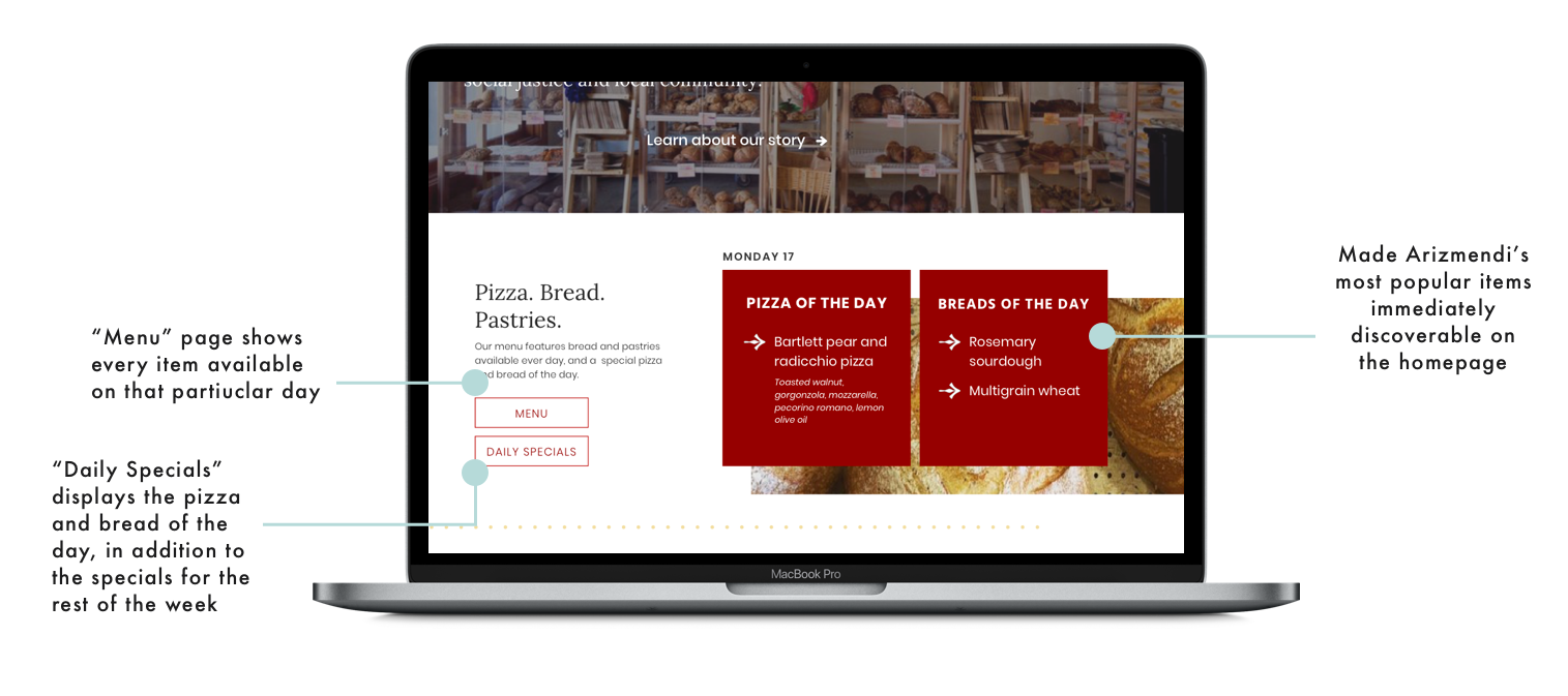
Each of the three menu pages is now discoverable from the homepage.
Distinguishing the brand
I heard from users they wanted to learn more about what distinguishes Arizmendi from other businesses. Specifically, they wanted to learn about Arizmendi’s signature products and see more information about the co-op model, as these would be factors that would influence their decision of whether to visit.
Because I learned my target audience is active online, I also wanted to integrate social media into the website to encourage further engagement with Arizmendi digitally.


Brand analysis: making it authentic
Methodology Visual design — Branding — Testing
Designing for different audiences
The challenge at this phase of the project was to make the UI of the website consistent with the legacy branding of the bakery. I also realized UI could be a way to reconcile my earlier question of how to balance the priorities of my primary and secondary personas.
Making it authentic
To develop my brand strategy, I returned to notes from my interviews and testing, using words that current customers and new customers had used in their descriptions of Arizmendi.
I drew color and typography inspiration from the brick-and-mortar bakery itself, making the digital experience indicative of what a customer could expect in person.
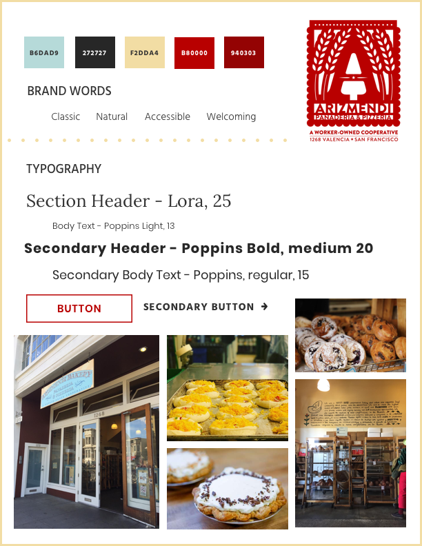

A brand concept test validated my branding decisions. Users called out quality, community, and unique products as distinguishing characteristics.
Testing the outcome
A key measurement of the success of this project was to test whether my target audience would interpret the branding of the website in a way that aligned with my goals as a designer and Arizmendi’s goals as a business. I created a prototype in Invision using my final mockups and conducted a concept test, asking four participants to navigate the website and answer questions that would test their interpretation of the business and brand.
Next steps and reflection
Next steps
As a next step, I would want to test the final mockups with my secondary audience, evaluating whether the new website aligns with their existing perception of the brand.
I would also recommend that Arizmendi consider adding more features to the website that would extend the impact of the brand to other social media platforms. Given the community aspect of the business, Arizmendi could consider adding a blog or live Instagram feed.
Research isn’t linear
After realizing during my research phase that I was dealing with two very distinct audiences, I decided to circle back and conduct additional in-person interviews before carrying on with the project. This step was crucial as it gave me a more clear understanding of the goals and motivations of my primary user.
Testing is key
A success of this project was my ability to collect direct feedback from my target users. I conducted frequent testing and incorporated numerous rounds of edits into the wireframes. The challenge of the menu was a great example of how quick testing with users helped me reach a solution.
I think testing with more users at earlier stages of the design process could have saved time and allowed for faster iterations.