
I designed a messaging feature to deepen engagement among privacy-conscious users.
My Roles
Market and user research, sketching, wireframing, prototyping, remote testing
Outcome
Lift in user engagement
Boost in number of transactions
Greater feelings of trust and security
A shift toward privacy
The social network feature within Venmo is an essential component of the platform’s unique value add and at least partially responsible for its rapid adoption, especially among millennials. However, among my own circle of peers, I had observed a gradual transition toward increased measures to ensure privacy while using the platform, compromising at least some aspect of the social sharing that Venmo encourages and relies on for user engagement.
I began to think about ways that Venmo could be reconfigured with the consideration of increased user privacy, while still maintaining the social media aspect that is a key factor in Venmo’s success.
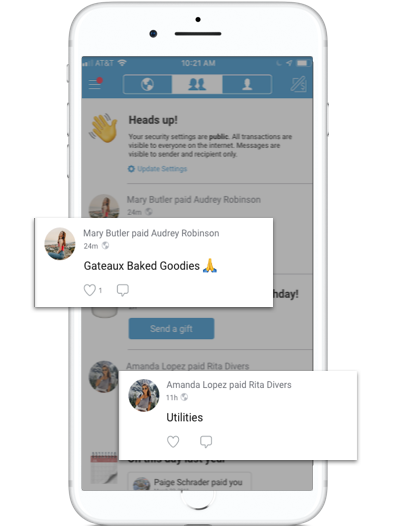
Unless manually updated, user activity in Venmo is visible to the public
Validating the opportunity
Methodology Market Research — User Interviews — Affinity Mapping
The business case for social media
I first wanted to validate the importance of social media as a contributing factor in Venmo’s success. A survey of available data confirmed that the majority of Venmo’s user base falls within a younger demographic and is engaged with other social media platforms:
Nearly 75% of Venmo users are below the age of 35
89% of Venmo users have the Facebook app (compare with 44% of PayPal users)
82% of Venmo users have an Instagram account (compare with 36% of PayPal users)
Venmo users are typically engaged with other social media platforms. But how do they feel about and use social media features within the app?
What I heard from users

1. A shift toward privacy
— There was a general trend among users toward increased privacy as 5/7 participants had updated their default settings to private
2. Minimal social engagement
— Users noted a lack of interest in the main activity feed. Most social interaction occurs between two individuals involved in a transaction
3. Lack of transparency
—Users unanimously agreed that the current privacy settings are confusing and a little unclear
The problem
Venmo users need more opportunities for personalized interaction because they are increasingly using the app with greater privacy measures.
Click here or scroll down to see the solution I ultimately reached.
Design Brainstorm
Having identified the problem I was solving for, I brainstormed several how might we statements as a framework moving into the design phase.
How might we:
Make users feel comfortable sharing information, on their own terms
Encourage social connection in a way that feels safe and personal
Create a sense of trust between users and Venmo
Help users connect more with friends and family
Help users continue social interaction even after the transaction is complete
Designing the features
Methodology Sketching — Wireframing — Task Flows — User Flows — Information Architecture
Making interactions feel personal
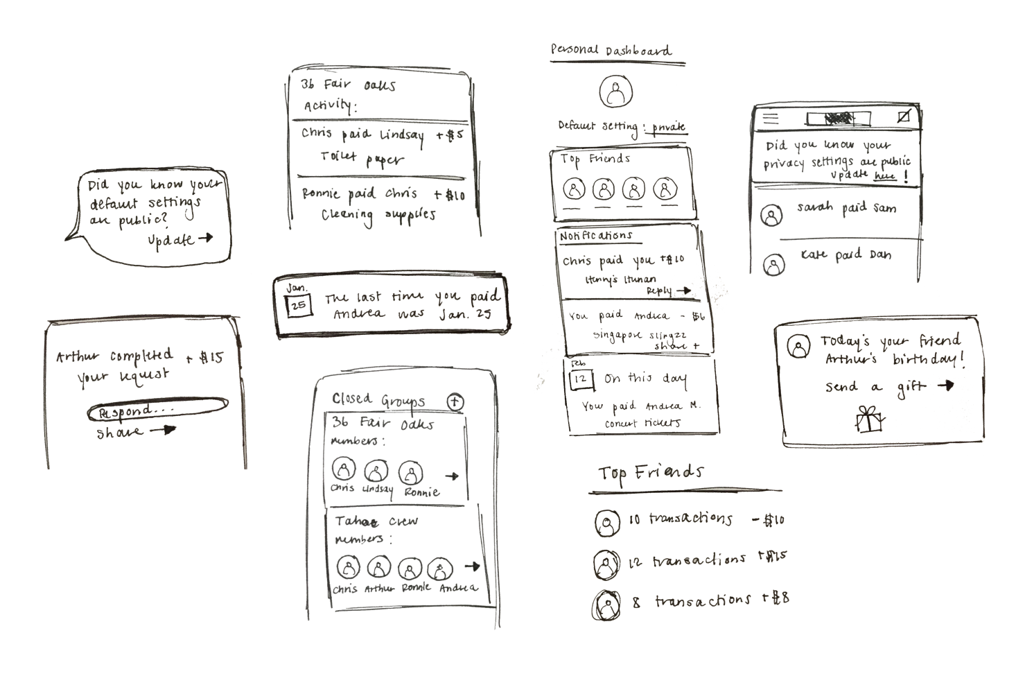
I began with a rapid brainstorm of design features that would increase social interaction in a way that felt personal and private, but still fun.
Personal Messaging (my solution): would already be familiar to users from their experience using other social media platforms; could help extend interactions beyond the transactions
Notifications in the activity feed (my solution): personalized notifications would make the home screen more interesting to users, and also be a way to generate more transactions and social engagement in the app
Privacy Dashboard: users would have a personalized panel with their security settings and other notifications; I ultimately ruled this out, thinking the effort would outweigh the impact and felt like a clunky solution
Closed Groups/Top Friends: Users could limit activity visibility to a hand-selected group of friends; has some potential, but Venmo already has a privacy setting that limits visibility to friends — this felt like an inadequate solution for my users who strongly dislike the group aspect of Venmo’s social sharing
Opportunity for greatest impact
Weighing these different options, I returned to what I heard most frequently from users during my initial interviews:
The primary goal when using Venmo is to make or complete a transaction with another person
Lack of interest in the main activity feed
Based on this feedback, I prioritized the following two features for my solution moving forward.
1. Messaging Feature: extend the interaction between two users beyond the completion of a transaction
2. Personalized Notifications: make the activity feed more relevant and actionable
Encourage interaction, reduce friction
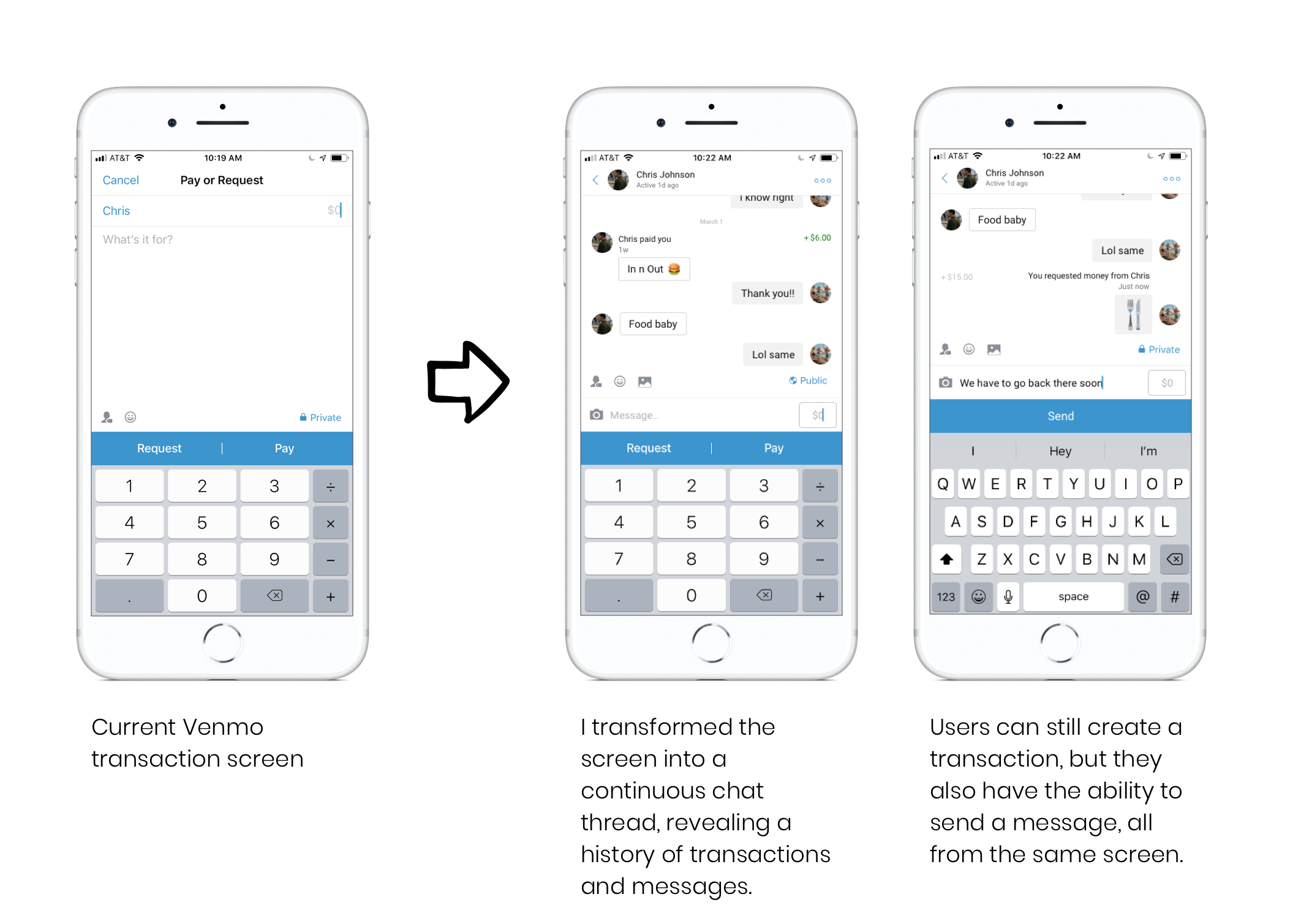
When thinking about how to best integrate messaging into the existing app, my challenge was to design a solution that made the new feature discoverable to users but not disruptive of their primary goal: creating a transaction.

Integrate the user flow
After sketching out a few options for the combined transaction/messaging screen including a toggle or dashboard control, I felt the design was still feeling like a bit of a disruption or afterthought.
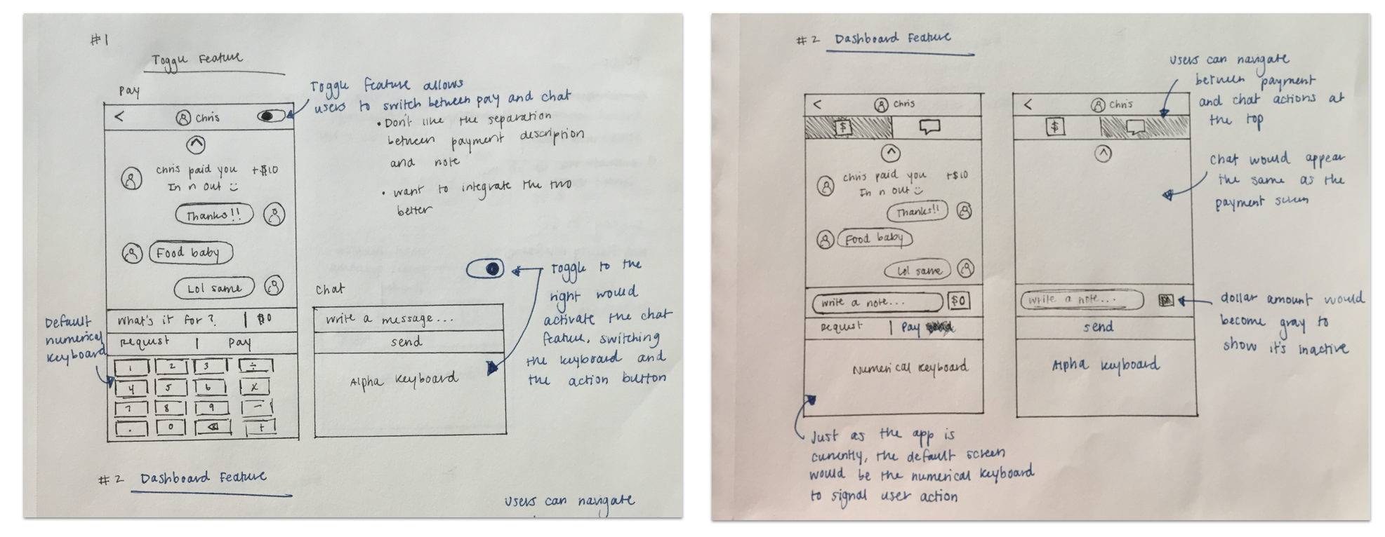
My initial sketches kept messaging and transactions on separate screens. After testing a paper prototype with a user, I realized this flow was disruptive and created too much friction.
I decided to pivot from that initial idea and looked to Venmo’s current task flow as a guide.
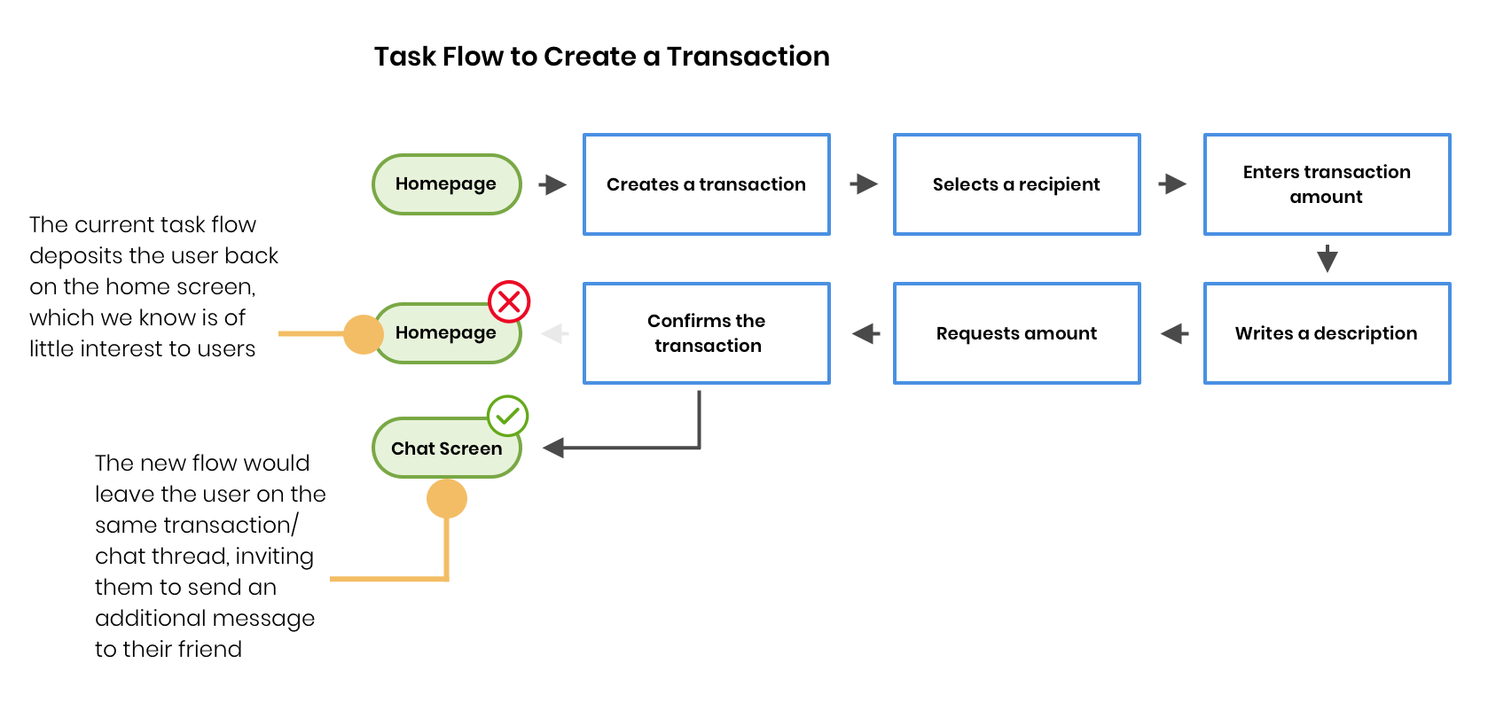
The least intrusive design would maintain the existing flow, but create the opportunity to continue the conversation

The design I finally landed on merges both features into a single screen, guiding the user to toggle between the two through interaction cues.
Make it discoverable
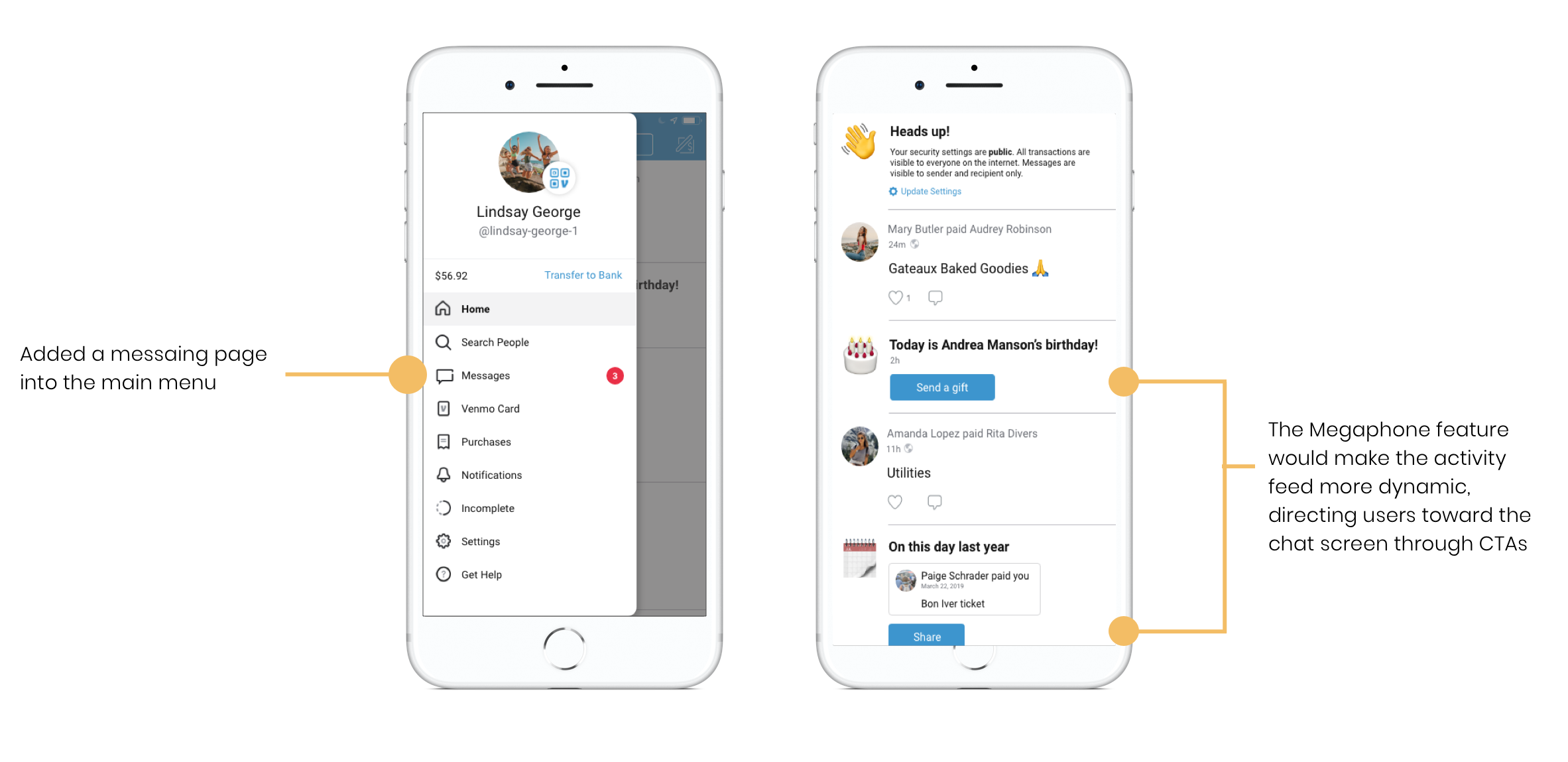
Hoping to avoid complicating the existing information architecture, I initially thought it might not be necessary to add a separate menu item for messages, but integrate it into the flow of existing pages.
After testing mid-fidelity wireframes with several Venmo users, I modified my design to make it more discoverable.
Building trust among users
Methodology Prototyping — Remote user testing
Desire for transparency
My initial conversations with users revealed a general feeling that the current design of the app could be more transparent in communicating security settings and how to update them.
I tested a finished prototype of the design with several users, asking them how they might expect to control the privacy settings of the new messaging feature and incorporated their feedback into the screens below.
My first attempt
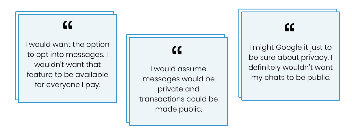
At first I experimented with a pop-up security notification, but I heard the following feedback from users:
Like the added transparency, but pop-up feels disruptive and annoying
It still feels inconvenient and a little unclear how to update your default settings
Hearing this feedback I went back and sketched out some other options, reaching my final solution below.
Incorporating user feedback
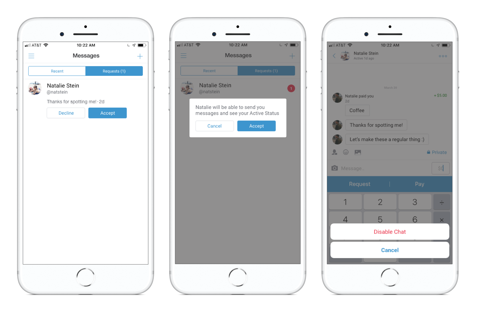
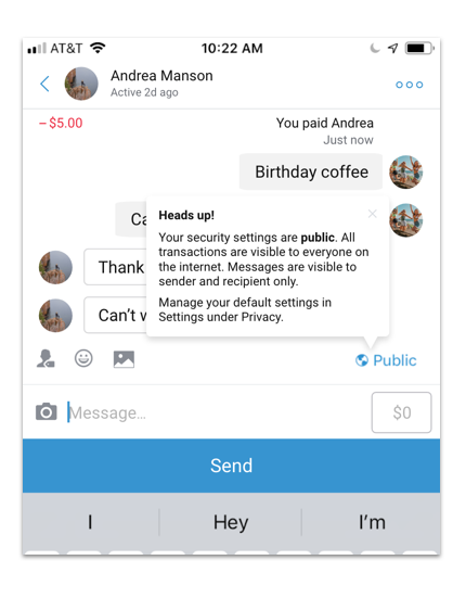
Users would have to accept messages from people they had never interacted with before. They would also have the ability to disable the chat feature, but still make and receive transactions with the other person.
Putting it all together
Methodology Prototyping — Remote User Testing
The solution
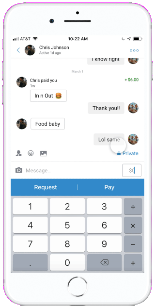
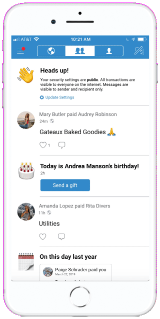
The chat feature encourages users to extend their social interaction beyond the completion of a payment, in the context of a one-on-one conversation.
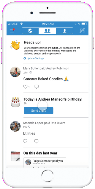
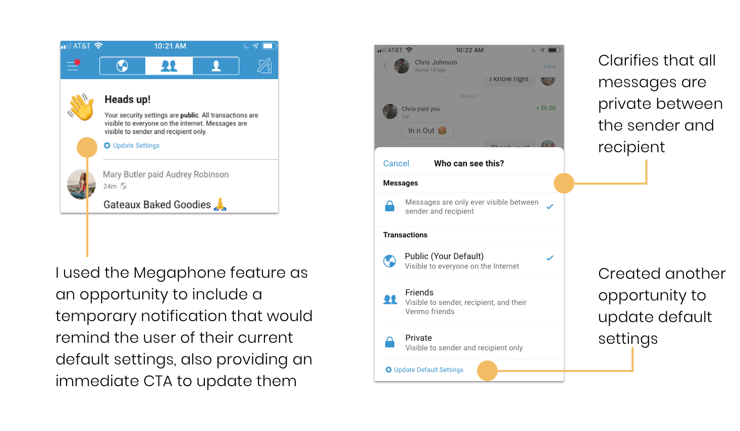
I modified the home screen activity feed, incorporating a Megaphone feature that would provide personalized notifications like privacy setting reminders, birthday notifications, or memories of past activity that would encourage users to interact with friends while creating more transactions.
Measuring success
To evaluate whether my solution actually succeeded in addressing my initial design problem, I used my final prototype in Adobe XD to conduct remote tests with several users, focusing on the following key metrics:
Ease of task flow
Users experienced no issue completing their given task of making a transaction, validating my decision to incorporate the chat feature into the existing framework.
“I really like that everything exists on one page now. It’s much easier to see my payment history.”
“It’s really convenient you can just scroll. You don’t have to go back and forth between different transactions.”
Increased social engagement
Even users who described zero social engagement with Venmo in my initial user interviews could identify scenarios where they would use the messaging and megaphone features.
“I love the birthday prompt. I would definitely use that with friends who live in different cities.”
“It wouldn’t be my primary form of messaging but I could definitely see myself sending messages to friends.”
Building trust
Users expressed increased feelings of trust and clarity when it came to privacy settings and how to update them.
“I really like to see the extra heads up on the home screen, especially for users who maybe aren’t as conscious of their privacy as I am.”
“The increased communication surrounding privacy makes the app feel more transparent.”
Conclusion
This project was a challenging but really fun exercise. Part of the genius of the current Venmo platform is the simplicity of its design — what gives it such great utility is the absence of feature clutter. I wanted to be especially mindful of this and design a solution that would be of actual use to users, not just another page to ignore in the hamburger menu.
Wins
The new features seemed to really excite my users and improve their current experience of the app. When I tested my completed prototype, they were quick to say they found the continuous message history a much easier way to keep an ongoing record of their transactions with their friends. Overall, I feel I was able to reach a solution that was mindful of Venmo’s goals as a business and the goals of my users.
Challenges
One of the biggest challenges of this project was figuring out the best way to incorporate messaging into the existing information architecture of the platform. I invested heavily in the early stages of sketching and mapping out user flows, but after testing a paper prototype with users I ended up pivoting from my original idea and restructured the IA to make it more seamless. What now seems like a pretty simple solution was a labor of love!